If you’re a B2B business, you know that your website is often the first impression you get to make on your prospective clients. It can also serve as the account manager for return business, a PR executive for your outreach efforts, a brand manager to sing your praises and a support agent for common enquiries.
In other words, your website is a big deal.
Some businesses seem to excel at creating B2B websites, while others tend to miss the point a little, or don’t seem to understand what makes a great B2B website. The best B2B websites include aspects that you wouldn't find on B2C websites or even other webpages found on the internet. That’s what makes good B2B website stand out from the crowd and perform a function for the companies that create them.
This blog post recognises 5 great B2B websites, and why they’re able to achieve digital B2B fame.
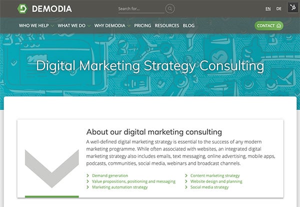
6: Demodia - User experience before conversion
Demodia gives the visitor what they want, and in turn they convert.
Not to blow our own horn (too much!), but it would seem incomplete and an injustice to not include our own website on this list. After all, as a marketing agency that specialises in the B2B sector, we should lead our clients by example.
We've often received compliments on how easy our site is to locate user-relevant information using things like our quick navigation feature at the top of each page. We’ve also been told how informative our website content is in general, with not too much marketing or self promotion. The truth is that this stems from our design philosophy, where we believe that if we help our visitors, our website visitors are more likely to support us in the future.
We also believe that the more educated our clients and leads are, the more effective their marketing will be, which means everyone wins.
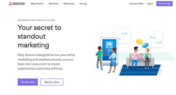
5: Asana - Simple yet effective design
Asana proves that you don’t need to reinvent the wheel to drive traffic to your call to action.
While the website is quite plainly in the theme reminiscent of a WordPress layout, Asana’s website is more than it appears. Each section of their website makes their call to action the star of the show, encouraging visitors to click it. They also make masterful use of lightweight animations that show their product in action without slowing their website down or distracting the user.
A special mention should go out to their templates gallery, where Asana showcases what their platform is capable of, whilst still targeting and segmenting their targeted leads. The gallery is simple to use, interactive and grabs attention with its layout and design.
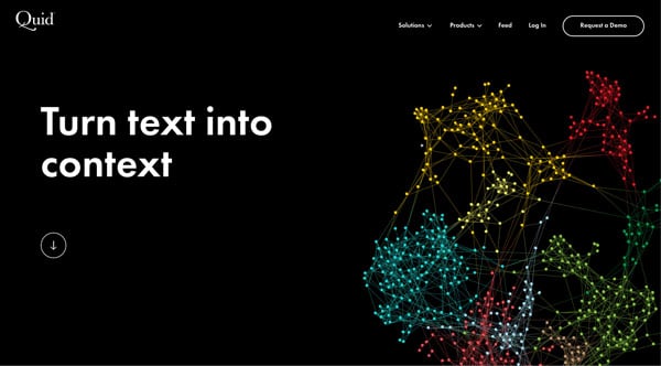
4: Quid - Less content, more message
Quid treats design, viewer attention and performance as precious resources.
Quid has a total of 250 words on the front page of their website. That is about a quarter of the average word count for a blog post. Their black background and white text is a bold move that pays off because their entire website is dedicated to a minimalistic approach that improves usability, doesn’t drain attention, and draws attention to their message—smaller statements with greater impact.
Quid’s entire website follows this trend, and focuses on large images, and longer scrolling to keep and direct their visitor’s attention. Quid also ends each page with a CTA to take a demo, which helps convert visitors before they leave each page.
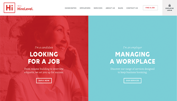
3: HireLevel- A Tale of Two Personas
HireLevel is a case study in marketing personas done well in the form of a website.
Identifying marketing personas have been a staple of marketing strategy for as long as any millennial can remember. HireLevel embraces this tried and true aspect within the very design of their website. As soon as you hit the home page, it presents two calls to action that funnel each visitor into one of two personas—candidates and employers.
Should these two categories not catch you, continuing to scroll will present four of HireLevel’s core services that should appeal to their target market. HireLevel’s blog is also noteworthy and full of helpful tips for both targeted personas, and the entire website takes a personable approach and tone which sets it apart from the colder, more professional style of other B2B websites.
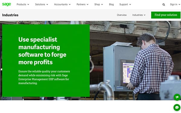
2: Sage - Content that Calls
Sage does an excellent job of providing content that converts.
Content is still king, and no B2B website (outside of HubSpot) embraces this fact more than Sage. When visiting the website, you have a multitude of content options available to you that provide insights or highlight the strong points of Sage. The important thing to note here is that a call to action is always available and never far away from each content offering. This means that if the content has convinced you, you can immediately convert—if not, there’s always more content to keep persuading you until you do.
The immense amount of content further helps with SEO, enabling Sage to claim the top spot on their targeted search keywords and phrases.
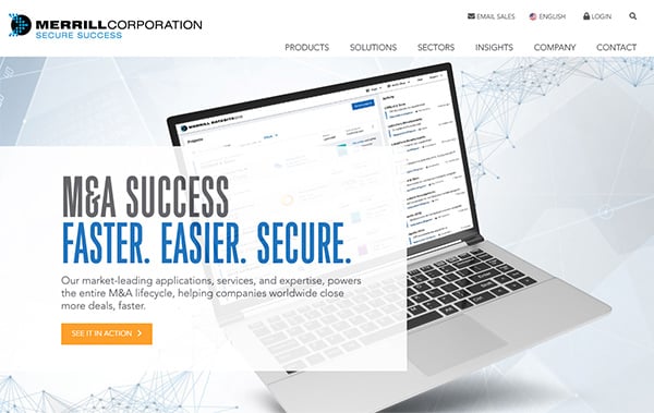
1: Merrill Corporation- Content Funnelling Done Right
Merrill Corporation’s name may be vague, but their website is not.
Merrill Corporation’s website has a bit of everything, and all those bits are done really well.
The first thing you see on their website is a description of what they do, why it helps you and an encouraging CTA to demonstrate their solution in action. This is accomplished within 20 words, and sets a strong precedent for the rest of the website.
As you continue to scroll, you’ll be presented with an overview of their solution, feature showcases and a highlight reel of the awards that they have achieved. After this, they again present you with reasons why you should use their services and are clear with their CTA. Finally, if none of that has convinced you to convert yet, they present very entertaining 15 second videos that explain exactly what they can do for your company along with an easy to use share functionality.
This is an example of funnelling leads with lighter and less demanding content in order to provide more options to convert them without chasing them away, and Merrill Corporation’s website does this expertly.
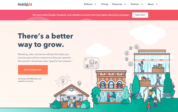
BONUS: HubSpot - Something for everyone
HubSpot is a website template for success.
It may seem a little unfair to include a company whose entire business is centred around offering tools that build website experiences, but HubSpot is too good to pass up.
Their website seems to do everything right without sacrificing too much on either end of the spectrum. There is a lot of content, but it’s not suffocating. There are plenty of CTAs, but they never seem pushy. Their pricing is easily accessible and detailed, but never overwhelming.
The reasons for this go deeper than one blog post could fairly explain, but HubSpot’s clean, clear and flat design is a common theme throughout the website that gives the content enough space to be digestible. The language HubSpot uses is also devoid of any technical terms until they have confirmed (by the choices of the visitor) that the person can fully understand and appreciate them. HubSpot’s blog is one of the best in the world, and covers an immense amount of topics whilst still including enough image-based resources to keep the attention of their audience. The options for each visitor are clear, understandable, and follow a logical flow that eventually leads to a conversion.
There is a lot more to cover regarding HubSpot’s website, but these are a few reasons why it’s such a great B2B experience.
Build Your Own Masterpiece
Reviewing awesome websites like the ones in this blog post can offer inspiration and motivation to create something truly unique in the B2B marketplace. By learning what these websites excel at and what they can improve upon, you’ve already started your journey of creating a memorable B2B experience.
Are you ready to build and create your own piece of the internet with a B2B website that not only attracts, but also converts visitors? Demodia is a digital marketing consultant with decades of experience in creating and operating great B2B websites that delight, convert and surprise your website visitors.
Contact Demodia today and get started on giving your B2B business the image it deserves.
