

There's a quote from Shakespeare which goes "all that glitters is not gold". This may seem somewhat irrelevant when applied to landing pages and conversion rates but just consider for a second substituting the 'glitter' for 'traffic' and it may not seem so far off anymore. In other words – not all traffic is gold, though it may glitter, while a good landing page on the other hand may prove to be a treasury which you should seriously make use of.
According to industry statistics, there can be a 50% and more increase in leads with even a minimum increase in the amount of landing pages. But quantity is not the only thing to be considered – all landing pages must be of high quality and offer users a quick, simple, graspable and yet in-depth understanding of what the particular landing page is about. In this, layout and design of the landing page play a major role and must be well-balanced with the content and information which are presented, in order to yield the best results. Consider therefore the following 5 best practices in landing page design in order to convert 'lead' into 'gold'.
1. Clear Branding
Let's begin with branding – because a landing page is all about your brand, what you do and who you are. It is a well-known fact in marketing that it takes about 3 seconds for a visitor to either convert to a lead or simply leave. These few initial seconds are a very important threshold and if you manage to keep people interested, chances are you will be noticing this in the amount of conversions.
Good branding will let visitors know where they are and what this is about, especially if they came to your landing page from a non-branded source, such as a link on social media. Furthermore, being consistent in where you position your brand logo and message and keeping that same position on all landing pages will provide visitors with a smooth experience. To sum up, your branding should provide visitors with the following information: who you are, what you do, what it is exactly that you are offering on this particular landing page. Have a look at how Square retain their design and branding all throughout their different pages, making browsing much more user-friendly.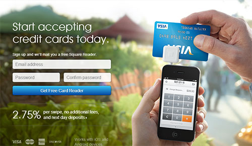
2. User Experience
The point of a landing page is for people who have clicked a targeted ad to land there. That means that when they click that ad, they will also have expectations about what they will find – so sending them to the home page, instead of a landing page, is a bad idea altogether. Furthermore, having no navigation options on your landing page is also not recommendable. Apart from presenting visitors with clear and comprehensible information and layout, you also need to provide them with options to continue, go somewhere else or even leave. Your analytics, for example, should tell you what people are searching for the most so that you can include it in the navigation.
Additionally, providing visitors with options, gives them also a feeling of retaining control of their experience, instead of feeling forced into making a purchase or subscribing for something. Take that away and people will almost automatically resist whatever it is you're trying to persuade them to do and will force their way out. Once that happens – you've lost them.
3. Design and Composition
There is a significant difference between a common web-page and a landing page. This makes a big difference when it comes to the design of both. It should be kept in mind that while a common web page's aim is to mostly provide information and maybe guide users to other pages, a landing page is much more straightforward and direct in its demands (which is the reason you should also provide users with the possibility to navigate, in case they're not quite sure what they want).
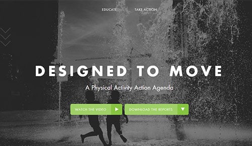
A landing page's goal is the CTA – the call-to-action – demanding visitors to do something. As such it is allowed to have a slightly different design, though certain things should remain unchanged (such as the brand logo). The design must represent the 'idea' of what the landing page is about and can therefore be more bold, both in shapes, fonts and colours, without going over the top, of course. That's also related to how we perceive things – bigger shapes and contrasting colours are perceived faster than, say, a minimalistic design. Therefore, you should make your CTA stand out. Take for example, Designed to Move and how their design makes both their CTA and brand stand out.
4. Clear CTA message
Once you have your design and composition in check, have a look at your CTA. Main rule of any CTA, whether you're offering something free, asking people to subscribe or fill out a form, is that it should be clear and concise. No beating around the bush. Ask yourself – what is it that you want people to do and then state that clearly.
Don't say 'download' and then ask people to fill out forms before that, neither say that something is free if it's not. That's simply annoying. Instead, let them know they need to subscribe before they can download your free e-book. In other words – be honest and they'll appreciate it.
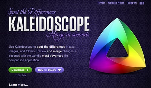
The Kaleidoscope app website is a good example of this – the CTA is clear and what you see is what you get.
5. Clear Directions and Instructions
Once visitors have followed your CTA, you should provide them with clear directions as to what follows next. Say you're an online bookstore. After users add books to their cart and decide to checkout, they should be taken through the process of ordering in a clear manner with all the necessary instructions as to what, why and when.
As with all of the above tips, the main rule here is – put the customer/user first. Make sure that the landing page is tailored to their needs, make it easy for them to navigate, make the CTA and design compelling but not forceful, provide them with options and freedom, guide them through the process and hold their hand. It is all about 'banana-discovery' and the easier that goes, the more visitors will not only be willing but also pleased with choosing what you have to offer.